Following on from our previous session with Fred we were asked to sit in our groups of three to continue with our work. We had taken our printed free ad designs which represented each individual ready to work with.
Firstly we were asked to write down from memory or look in our notebooks for the answers we had written down for how we would describe our own design practice and how we would describe ourselves as a person.
Design Practice
- Clean
- Professional
- Simplistic
- Minimalistic
- Monochrome
Myself
- Neat
- Clean
- Polite
- Conscientious
- Dedicated
We then had to write down our responses to all of our ads and say write down all of the words we felt were portrayed through the examples.
Myself
- Clean
- Professional
- Sophisticated
- Minimal
- Legible
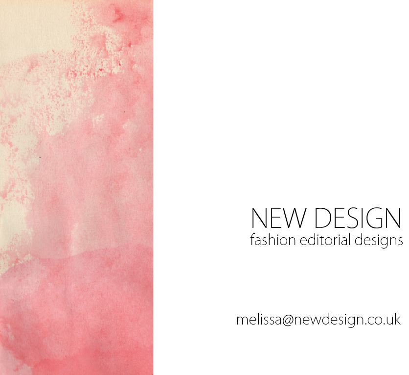
Melissa
- Fashion
- Colour
- Texture
- Professional
- Illustrative
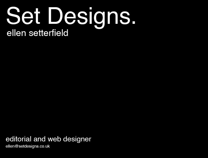
Ellen
- Simplistic
- Monochrome
- Professional
- Bold
- Clean
We were then asked to swap groups with another group in the class and sit infront of their designs. We then had to write down the similarities and differences of the designs for each individual person. It turned out that there were a lot of varying designs which indicated that the initial interview with that person to gather information was obviously not as successful as it could have been. However there were some people who had portrayed their team members in the same way and had obviously had the same impression from the original interview.
We then went back to our original table and sat infront of our group's designs. We were asked to write down the commonalities and differences between the other groups' response of our three designs we had to represent ourselves. Mine were as follows:
Commonalities
- Simple
- Sophisticated
- Minimal
- Modern
Key differences:
- Layout
- Shape
- Colour
- Composition
We then looked at the designs themselves and wrote down the things we felt worked and didn't work to represent ourselves. I found this quite hard as I didn't want to offend anyone by writing the wrong thing but it was interesting to analyse the reponses.
Work
- Monochrome
- Typeface
- Simplicity
- Less is more
- Neutral tones
Don't work
- Logo (LJB) because I don't actually like my own design anymore
- Underlining of text
- Background (perhaps plain would have worked better to enhance the foreground)
- Illustration
- Deduct the amount of words
We then worked as a three in our group to answer the following question:
How important is it for our personality to reflect our practice?
Pros
- Identity
- Distinctive
- Personal
- Signature style
- Individual
Cons
- Personality can become too dominant
- Practice doesn't always represent personality and vice versa
- Design is always for a topic so can't always involve personality
- Someone's personality may not be professional may not be professional and is a hinderence to design
- Not good to be limited to a certain way of working
TASK
5 statements about the relationship between your personality and practice:
1. I always find that having a cup of tea helps me stay motivated and makes me feel at home as this is something I have grown up with.
2. I have strong beliefs in philosophy. I find that a lot of the time life problems can be solved by simply taking the time to reflect and find the most appropriate solution, a book which helps me to do this is called the Secret.
3. Lake Windermere is a place I always look forward to visiting once a year, I find it so peaceful and relaxing and often feel inspired when I am there as it gives me a chance to wind down and take in the surroundings.

4. Although this may sound like an obvious choice to include in this post, I couldn't not include it. I feel as though my life experience has moulded who I am today and I would most certainly not have reached where I am today if it hadn't been for all of the positive and negative events in my past.
5. I absolutely love being organised in a diary and also having new stationery. I have always loved having a variety of pens, pencils and files to organise all of my work and I will usually buy it particularly if I fall in love with the design of them.
5 statements as a practitioner/designer:
1. It is important to be able to value the effect black and white design can have and to be able to appreciate the professionalism it portrays. As a designer I absolutely love designing in this way and find it very inspiring when I come across design work which is outstanding and unique, using the same colour scheme. I feel as though it is a skill to be able to grasp and achieve as a lot of the time black and white designs can also look unprofessional and not half as successful as they could be.
2. I feel as though professional, corporate editorial design would represent my designs. I would say this is the audience I design for. Someone who is interested in design which is ultimately crisp and stylish.

This website was found via the Graphic Exchange website I regularly visit. I like this designer's work as it correlates closely to the way I work too.
3. Packaging should be innovative and creative. It should remain professional but there is always room to be playful and experiment with unique ideas and designs, this is what makes something intriguing and enticing.

Source
4. Having had some previous experience in web design prior to university I would really love to improve upon it and possibly go down this route in the future. I feel as though there is so much scope within web design as everyone is online in this day in age and it is a successful way of advertising companies. One website I love in particular is the HIGH clothing website. I love the logo but also the way the website is composed.
5. I love monochromatic design as well as sans serif fonts. This illustrates both of these things in one design. I find sans serif fonts are more modern and striking and they work really well in this example to frame the black and white photograph.

This was taken from the Volt Cafe website, I love all of the work on there and the photography is also very well done.


