Monday, 4 March 2013
OUGD406 - Communication Is A Virus: Printing Costs
Today Harrison and I inquired about printing costs to Mike Flower. Simon suggested for us to ask about this because our brief is in aid of charity. However, when we went to ask we didn't get the response we had hoped for. We are therefore going to have to rethink our printing costs and the stock we are going to use. It all depends on how much we want to spend on printing as a group. I don't mind spending on it as it is for charity but we will have to have a group meeting about it.
PPP - OUGD402: Personality and Practice Studio Session
What makes me me?
What makes me a designer?
Using the imagery and text we had collected for this session we were asked to get into pairs and swap our own with another pair and then move to another table so that the work we are looking at wasn't being overheard by anyone else.
I was paired with Harrison for this task and we firstly looked at Sarah's images.
We were asked to separate the images into personal and practice and then write down a 50 word statement for each of the categories. This was quite interesting, especially as we didn't have the written work with the images so we had to just make sure that they were as accurate as possible.
Sarah - personal
Yin/Yang - balance
Loves Disneyland
Buddhism - follows belief?
Loves Christmas
Infinity symbol
Sarah - practice
Psycho work - colourful
Papercut art
Charlotte's web
Concept development
Royalty - decorative design
Personal statement for Sarah:
Sarah either follows Buddhism beliefs or admires their views on life. She also likes the festive period of the year and possibly the colours involved in this. Sarah also loves Disneyland, possibly because it is magical and inspiring. The yin and yang symbol and infinity symbol could also represent peace, equality and something being everlasting.
Practice statement for Sarah:
Sarah is interested in psychodelic design from the 60's including both type and image. She also has a fondness for design that involves papercut and crafts. She values strong concept development and feminine aspects within her design such as decorative designs and colours.
Danielle - personal
Inspirational quotes
Hairstyles
Deserts
Obama
Weight?
Danielle - practice
Type
Editorial - layout
Screenprint
Grid and layout
Colour
Personal statement for Danielle:
Danielle has a keen interest in hair styles and colour and is constantly changing hers. She shows a strong admiration for Obama and also has a fondness for inspirational quotes. She loves deserts and has a sweet tooth but is self conscious about her weight.
Practice statement for Danielle:
Danielle has a strong interest in editorial design and layout. She likes to explore the use of colour whilst at the same time apply a grid to her work to ensure it works visually. She also likes to experiment with type and loves the outcome of screenprinting.
Harrison and I then got together with Danielle and Sarah to discuss what we had written. We then read out what we had written for our own individual statements to compare accuracy. It turned out that we all had a similar perception of each other, showing that we know each other quite well. This should be the case seeing as we were put into our 'Communication Is A Virus' groups and therefore we should know our group members quite well after two weeks of working with them.
Friday, 1 March 2013
OUGD406 - Communication Is A Virus: Crit
Today we had another crit. We went into the studio and sat around in a circle with Simon and two other groups. The other two groups went before us and spoke about their work and what they had produced over the past two weeks. We gave our opinions to them and then Simon made some suggestions.
Then it was our turn to present our work. I started by explaining how we had come up with the idea of 'Charitea' to tie Comic Relief in with the theme of tea. I then showed the rest of the group the belly band I had produced to wrap around the cup and explained how I had contacted Comic Relief for balloons, stickers and a fundraising form. I also showed the print out of the character designs Sarah had illustrated and explained how I had developed the idea to represent tea bags and the shape of them. We also explained how we had to get permission before we could definitely go ahead with the tea stand. Harrison, Beth and Danielle then proceeded to explain the pieces of work they had produced.
We were given lots of positive feedback and nobody really made any suggestions for what we could improve or add to our design work. I was quite surprised really as there is usually always improvements which could be made. In terms of cost though, Simon did say that we could probably get funding from the college as it is a charitable event. We will be going to ask about this on Monday and we will be inquiring about it to Mike Flower as he is in charge of this. We then spoke about the donation of 50p for each cup of tea and mentioned that people may want to donate more. So I said that we would benefit from having a box to collect the money in and after the crit I said that I would take on this responsibility. Other people suggested maybe having biscuits if we got the college funding, something like rich tea biscuits to tie in with the theme. Victoria suggested that we could maybe print off stickers to stick on the balloons and make them our own, we may do this if we have the funding.
We then asked about the A2 design boards and decided as a group that we would produce these on the Thursday before our presentation on the Friday morning.
I felt as though it was quite a useful crit in a sense that we were able to listen to other groups' ideas and compare the amount of work we had all produced and how different people had approached the brief. At the same time however I feel as though we, as a group didn't really gain that much in terms of developing designs. I am looking forward to doing some extra design work and creating the box because I feel as though there isn't much more that I can contribute with until we start printing promotional design work off next week.
Thursday, 28 February 2013
OUGD406 - Communication Is A Virus: Group Work Development
Today Harrison and I took on the responsibility to clarify a few issues relating to our tea stand. We went to the people in charge of building regulations and asked them whether it would be possible for us to go ahead with the tea stand on Thursday 7th February from 11am-2pm. We had a chat with them and discussed where we should locate it.
We were then asked to produce a floor plan to show where the table would be as well as the kettle and all of the other necessary equipment we will need. We also had to fill out a risk assessment sheet and email it back to them.
We then walked round the college to see how many floor stickers we will be needing and how many pages we will need to print them on. We made a to do list for the rest of our group as well which consisted of the following:
- Decide on font
- Contents and design sheet for poster
- Decide on logo
- Decide belly bands and bottom of the cup
- Crit and digitalise illustrations
Monday, 25 February 2013
OUGD406 - Communication Is A Virus: Power Crit
Today we had a power crit with Amber. We got together as a group before the power crit to make sure we had everything necessary ready. A couple of group members had proposed our idea to college on Friday and they said that we would have to complete a risk assessment form and draw out exactly where we would be setting up our tea stand.
We went outside the studio and decided the best place to locate the tea stand in the corridor but not in the way of any fire exits or entrances to any of the studios. We will be utilising the tap in the studio to fill up our kettle to make continuous amounts of tea.
After we had done this I asked the rest of the group about the brief and whether they had a written version from the weekend, but nobody had completed one so I asked the rest of my group to read over what I had written and everyone was happy with it so I printed it off ready for the power crit at 2pm.
During the crit Amber asked us where we were up to with our idea and we spoke about several issues. One of the issues was the fact that the Whittards tea would be too expensive and we would end up having lots left over which would go to waste. We therefore decided that we would use other flavoured tea bags which are more cost effective.
I also mentioned the cost of paper cups and how the ones I had found were quite expensive. Beth then mentioned that in her work they have lots that are often going spare so we are going to experiment with them before purchasing any.
Amber was happy with the brief and she was looking forward to the end result, as a group we are working really well together and I am excited to see what we produce.
PPP1 - OUGD402: Free Ad Development
I experimented a lot with Ellen's design. It was quite challenging for me to design for her, as I know her so well and live with her. This can work to my advantage but also meant that I wanted to get the design just right, as accurate as possible. I experimented with a variety of ways to present the information before settling on the final design.


PPP1 - OUGD402: Free Ad Final Designs
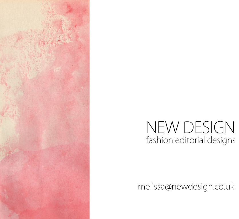
As Melissa has moved from a fashion degree, I get the impression that she would love to incorporate fashion into her work as much as possible. I also see her as being very feminine and enjoys use of colour. I hope I have managed to portray her as accurately as possible here.
This is my own personal ad design. I am happy with the outcome and think I have managed to portray myself as a sophisticated, professional graphic designer.

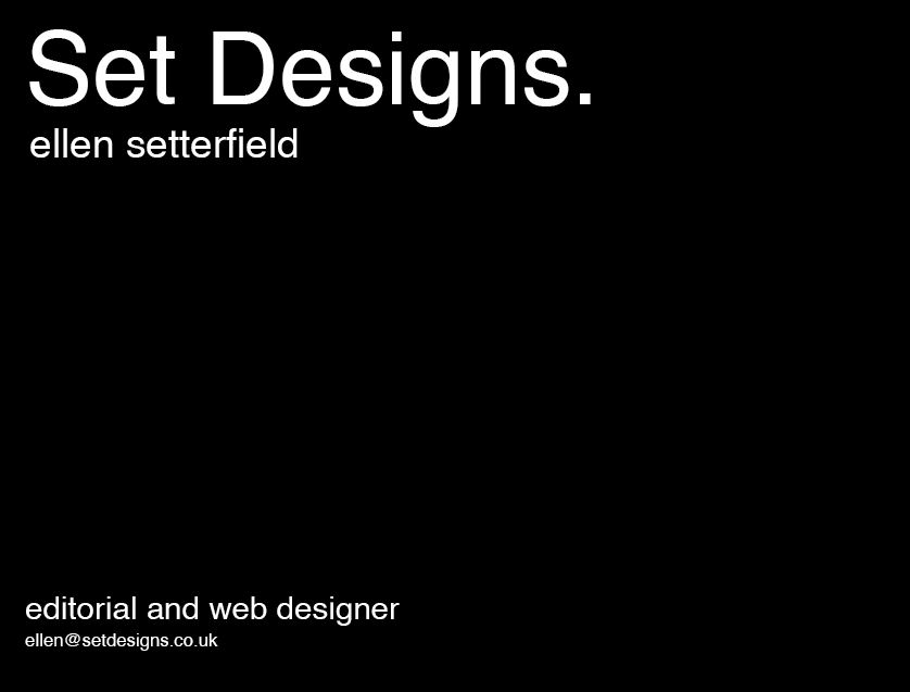
In the end I settled on this design for Ellen. I am pleased with the outcome and feel as though it represents her closely. I decided not to include the illustration she has of herself on her blog, as I didn't want it to give the impression that she only works on certain types of graphic design. I feel it is better to allow the audience to find out for themselves.
Subscribe to:
Posts (Atom)